68 lines
1.8 KiB
Plaintext
68 lines
1.8 KiB
Plaintext
---
|
|
sidebar_label: "Container"
|
|
---
|
|
|
|
export const metadata = {
|
|
title: `Container - Admin Components`,
|
|
}
|
|
|
|
# {metadata.title}
|
|
|
|
In this guide, you'll learn how to create a container component that matches the Medusa Admin's design conventions.
|
|
|
|
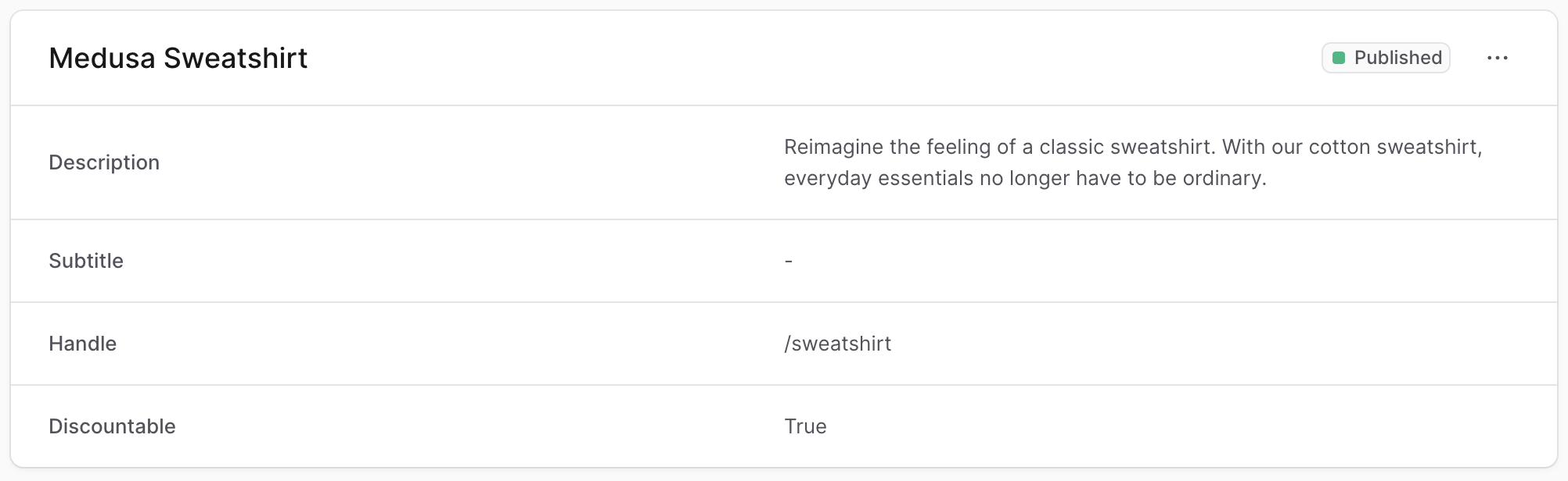
The Medusa Admin wraps each section of a page in a container.
|
|
|
|
|
|
|
|
To create a component that uses the same container styling in your widgets or UI routes, create the file `src/admin/components/container.tsx` with the following content:
|
|
|
|
```tsx
|
|
import {
|
|
Container as UiContainer,
|
|
clx,
|
|
} from "@medusajs/ui"
|
|
|
|
type ContainerProps = React.ComponentProps<typeof UiContainer>
|
|
|
|
export const Container = (props: ContainerProps) => {
|
|
return (
|
|
<UiContainer {...props} className={clx(
|
|
"divide-y p-0",
|
|
props.className
|
|
)} />
|
|
)
|
|
}
|
|
```
|
|
|
|
The `Container` component re-uses the component from the [Medusa UI package](!ui!/components/container) and applies to it classes to match the Medusa Admin's design conventions.
|
|
|
|
---
|
|
|
|
## Example
|
|
|
|
Use that `Container` component in any widget or UI route.
|
|
|
|
For example, create the widget `src/admin/widgets/product-widget.tsx` with the following content:
|
|
|
|
```tsx title="src/admin/widgets/product-widget.tsx"
|
|
import { defineWidgetConfig } from "@medusajs/admin-sdk"
|
|
import { Container } from "../components/container"
|
|
import { Header } from "../components/header"
|
|
|
|
const ProductWidget = () => {
|
|
return (
|
|
<Container>
|
|
<Header title="Product Widget" />
|
|
</Container>
|
|
)
|
|
}
|
|
|
|
export const config = defineWidgetConfig({
|
|
zone: "product.details.before",
|
|
})
|
|
|
|
export default ProductWidget
|
|
```
|
|
|
|
This widget also uses a [Header](../header/page.mdx) custom component.
|