239 lines
8.3 KiB
Plaintext
239 lines
8.3 KiB
Plaintext
---
|
|
sidebar_label: "JSON View"
|
|
---
|
|
|
|
import { TypeList } from "docs-ui"
|
|
|
|
export const metadata = {
|
|
title: `JSON View - Admin Components`,
|
|
}
|
|
|
|
# {metadata.title}
|
|
|
|
In this guide, you'll learn how to create a JSON view section that matches the Medusa Admin's design conventions.
|
|
|
|
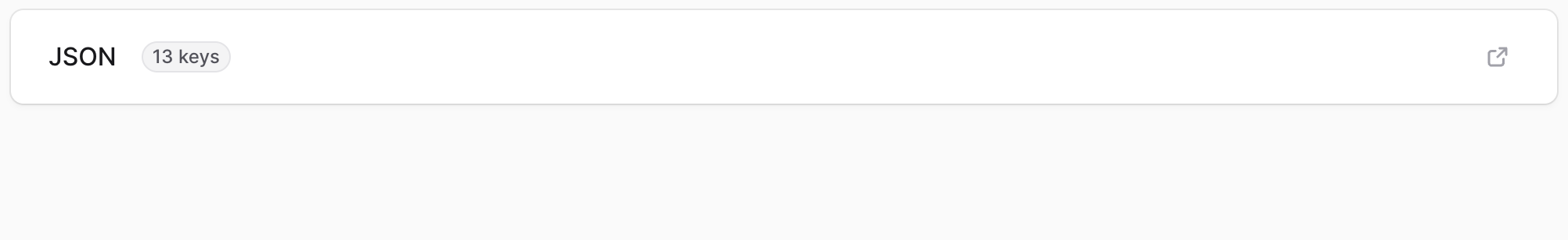
Detail pages in the Medusa Admin show a JSON section to view the current page's details in JSON format.
|
|
|
|
|
|
|
|
To create a component that shows a JSON section in your customizations, create the file `src/admin/components/json-view-section.tsx` with the following content:
|
|
|
|
```tsx title="src/admin/components/json-view-section.tsx"
|
|
import {
|
|
ArrowUpRightOnBox,
|
|
Check,
|
|
SquareTwoStack,
|
|
TriangleDownMini,
|
|
XMarkMini,
|
|
} from "@medusajs/icons"
|
|
import {
|
|
Badge,
|
|
Container,
|
|
Drawer,
|
|
Heading,
|
|
IconButton,
|
|
Kbd,
|
|
} from "@medusajs/ui"
|
|
import Primitive from "@uiw/react-json-view"
|
|
import { CSSProperties, MouseEvent, Suspense, useState } from "react"
|
|
|
|
type JsonViewSectionProps = {
|
|
data: object
|
|
title?: string
|
|
}
|
|
|
|
export const JsonViewSection = ({ data }: JsonViewSectionProps) => {
|
|
const numberOfKeys = Object.keys(data).length
|
|
|
|
return (
|
|
<Container className="flex items-center justify-between px-6 py-4">
|
|
<div className="flex items-center gap-x-4">
|
|
<Heading level="h2">JSON</Heading>
|
|
<Badge size="2xsmall" rounded="full">
|
|
{numberOfKeys} keys
|
|
</Badge>
|
|
</div>
|
|
<Drawer>
|
|
<Drawer.Trigger asChild>
|
|
<IconButton
|
|
size="small"
|
|
variant="transparent"
|
|
className="text-ui-fg-muted hover:text-ui-fg-subtle"
|
|
>
|
|
<ArrowUpRightOnBox />
|
|
</IconButton>
|
|
</Drawer.Trigger>
|
|
<Drawer.Content className="bg-ui-contrast-bg-base text-ui-code-fg-subtle !shadow-elevation-commandbar overflow-hidden border border-none max-md:inset-x-2 max-md:max-w-[calc(100%-16px)]">
|
|
<div className="bg-ui-code-bg-base flex items-center justify-between px-6 py-4">
|
|
<div className="flex items-center gap-x-4">
|
|
<Drawer.Title asChild>
|
|
<Heading className="text-ui-contrast-fg-primary">
|
|
<span className="text-ui-fg-subtle">
|
|
{numberOfKeys}
|
|
</span>
|
|
</Heading>
|
|
</Drawer.Title>
|
|
</div>
|
|
<div className="flex items-center gap-x-2">
|
|
<Kbd className="bg-ui-contrast-bg-subtle border-ui-contrast-border-base text-ui-contrast-fg-secondary">
|
|
esc
|
|
</Kbd>
|
|
<Drawer.Close asChild>
|
|
<IconButton
|
|
size="small"
|
|
variant="transparent"
|
|
className="text-ui-contrast-fg-secondary hover:text-ui-contrast-fg-primary hover:bg-ui-contrast-bg-base-hover active:bg-ui-contrast-bg-base-pressed focus-visible:bg-ui-contrast-bg-base-hover focus-visible:shadow-borders-interactive-with-active"
|
|
>
|
|
<XMarkMini />
|
|
</IconButton>
|
|
</Drawer.Close>
|
|
</div>
|
|
</div>
|
|
<Drawer.Body className="flex flex-1 flex-col overflow-hidden px-[5px] py-0 pb-[5px]">
|
|
<div className="bg-ui-contrast-bg-subtle flex-1 overflow-auto rounded-b-[4px] rounded-t-lg p-3">
|
|
<Suspense
|
|
fallback={<div className="flex size-full flex-col"></div>}
|
|
>
|
|
<Primitive
|
|
value={data}
|
|
displayDataTypes={false}
|
|
style={
|
|
{
|
|
"--w-rjv-font-family": "Roboto Mono, monospace",
|
|
"--w-rjv-line-color": "var(--contrast-border-base)",
|
|
"--w-rjv-curlybraces-color":
|
|
"var(--contrast-fg-secondary)",
|
|
"--w-rjv-brackets-color": "var(--contrast-fg-secondary)",
|
|
"--w-rjv-key-string": "var(--contrast-fg-primary)",
|
|
"--w-rjv-info-color": "var(--contrast-fg-secondary)",
|
|
"--w-rjv-type-string-color": "var(--tag-green-icon)",
|
|
"--w-rjv-quotes-string-color": "var(--tag-green-icon)",
|
|
"--w-rjv-type-boolean-color": "var(--tag-orange-icon)",
|
|
"--w-rjv-type-int-color": "var(--tag-orange-icon)",
|
|
"--w-rjv-type-float-color": "var(--tag-orange-icon)",
|
|
"--w-rjv-type-bigint-color": "var(--tag-orange-icon)",
|
|
"--w-rjv-key-number": "var(--contrast-fg-secondary)",
|
|
"--w-rjv-arrow-color": "var(--contrast-fg-secondary)",
|
|
"--w-rjv-copied-color": "var(--contrast-fg-secondary)",
|
|
"--w-rjv-copied-success-color":
|
|
"var(--contrast-fg-primary)",
|
|
"--w-rjv-colon-color": "var(--contrast-fg-primary)",
|
|
"--w-rjv-ellipsis-color": "var(--contrast-fg-secondary)",
|
|
} as CSSProperties
|
|
}
|
|
collapsed={1}
|
|
>
|
|
<Primitive.Quote render={() => <span />} />
|
|
<Primitive.Null
|
|
render={() => (
|
|
<span className="text-ui-tag-red-icon">null</span>
|
|
)}
|
|
/>
|
|
<Primitive.Undefined
|
|
render={() => (
|
|
<span className="text-ui-tag-blue-icon">undefined</span>
|
|
)}
|
|
/>
|
|
<Primitive.CountInfo
|
|
render={(_props, { value }) => {
|
|
return (
|
|
<span className="text-ui-contrast-fg-secondary ml-2">
|
|
{Object.keys(value as object).length} items
|
|
</span>
|
|
)
|
|
}}
|
|
/>
|
|
<Primitive.Arrow>
|
|
<TriangleDownMini className="text-ui-contrast-fg-secondary -ml-[0.5px]" />
|
|
</Primitive.Arrow>
|
|
<Primitive.Colon>
|
|
<span className="mr-1">:</span>
|
|
</Primitive.Colon>
|
|
<Primitive.Copied
|
|
render={({ style }, { value }) => {
|
|
return <Copied style={style} value={value} />
|
|
}}
|
|
/>
|
|
</Primitive>
|
|
</Suspense>
|
|
</div>
|
|
</Drawer.Body>
|
|
</Drawer.Content>
|
|
</Drawer>
|
|
</Container>
|
|
)
|
|
}
|
|
|
|
type CopiedProps = {
|
|
style?: CSSProperties
|
|
value: object | undefined
|
|
}
|
|
|
|
const Copied = ({ style, value }: CopiedProps) => {
|
|
const [copied, setCopied] = useState(false)
|
|
|
|
const handler = (e: MouseEvent<HTMLSpanElement>) => {
|
|
e.stopPropagation()
|
|
setCopied(true)
|
|
|
|
if (typeof value === "string") {
|
|
navigator.clipboard.writeText(value)
|
|
} else {
|
|
const json = JSON.stringify(value, null, 2)
|
|
navigator.clipboard.writeText(json)
|
|
}
|
|
|
|
setTimeout(() => {
|
|
setCopied(false)
|
|
}, 2000)
|
|
}
|
|
|
|
const styl = { whiteSpace: "nowrap", width: "20px" }
|
|
|
|
if (copied) {
|
|
return (
|
|
<span style={{ ...style, ...styl }}>
|
|
<Check className="text-ui-contrast-fg-primary" />
|
|
</span>
|
|
)
|
|
}
|
|
|
|
return (
|
|
<span style={{ ...style, ...styl }} onClick={handler}>
|
|
<SquareTwoStack className="text-ui-contrast-fg-secondary" />
|
|
</span>
|
|
)
|
|
}
|
|
```
|
|
|
|
The `JsonViewSection` component shows a section with the "JSON" title and a button to show the data as JSON in a drawer or side window.
|
|
|
|
The `JsonViewSection` accepts a `data` prop, which is the data to show as a JSON object in the drawer.
|
|
|
|
---
|
|
|
|
## Example
|
|
|
|
Use the `JsonViewSection` component in any widget or UI route.
|
|
|
|
For example, create the widget `src/admin/widgets/product-widget.tsx` with the following content:
|
|
|
|
```tsx title="src/admin/widgets/product-widget.tsx"
|
|
import { defineWidgetConfig } from "@medusajs/admin-sdk"
|
|
import { JsonViewSection } from "../components/json-view-section"
|
|
|
|
const ProductWidget = () => {
|
|
return <JsonViewSection data={{
|
|
name: "John",
|
|
}} />
|
|
}
|
|
|
|
export const config = defineWidgetConfig({
|
|
zone: "product.details.before",
|
|
})
|
|
|
|
export default ProductWidget
|
|
```
|
|
|
|
This shows the JSON section at the top of the product page, passing it the object `{ name: "John" }`.
|