500 lines
18 KiB
Plaintext
500 lines
18 KiB
Plaintext
---
|
|
sidebar_label: "Data Table"
|
|
---
|
|
|
|
import { TypeList } from "docs-ui"
|
|
|
|
export const metadata = {
|
|
title: `Data Table - Admin Components`,
|
|
}
|
|
|
|
# {metadata.title}
|
|
|
|
<Note>
|
|
|
|
This component is available after [Medusa v2.4.0+](https://github.com/medusajs/medusa/releases/tag/v2.4.0).
|
|
|
|
</Note>
|
|
|
|
The [DataTable component in Medusa UI](!ui!/components/data-table) allows you to display data in a table with sorting, filtering, and pagination. It's used across the Medusa Admin dashboard to showcase a list of items, such as a list of products.
|
|
|
|
|
|
|
|
You can use this component in your Admin Extensions to display data in a table format, especially if you're retrieving them from API routes of the Medusa application.
|
|
|
|
This guide focuses on how to use the `DataTable` component while fetching data from the backend. Refer to the [Medusa UI documentation](!ui!/components/data-table) for detailed information about the DataTable component and its different usages.
|
|
|
|
## Example: DataTable with Data Fetching
|
|
|
|
In this example, you'll create a UI widget that shows the list of products retrieved from the [List Products API Route](!api!/admin#products_getproducts) in a data table with pagination, filtering, searching, and sorting.
|
|
|
|
Start by initializing the columns in the data table. To do that, use the `createDataTableColumnHelper` from Medusa UI:
|
|
|
|
```tsx title="src/admin/routes/custom/page.tsx"
|
|
import {
|
|
createDataTableColumnHelper,
|
|
} from "@medusajs/ui"
|
|
import {
|
|
HttpTypes,
|
|
} from "@medusajs/framework/types"
|
|
|
|
const columnHelper = createDataTableColumnHelper<HttpTypes.AdminProduct>()
|
|
|
|
const columns = [
|
|
columnHelper.accessor("title", {
|
|
header: "Title",
|
|
// Enables sorting for the column.
|
|
enableSorting: true,
|
|
// If omitted, the header will be used instead if it's a string,
|
|
// otherwise the accessor key (id) will be used.
|
|
sortLabel: "Title",
|
|
// If omitted the default value will be "A-Z"
|
|
sortAscLabel: "A-Z",
|
|
// If omitted the default value will be "Z-A"
|
|
sortDescLabel: "Z-A",
|
|
}),
|
|
columnHelper.accessor("status", {
|
|
header: "Status",
|
|
cell: ({ getValue }) => {
|
|
const status = getValue()
|
|
return (
|
|
<Badge color={status === "published" ? "green" : "grey"} size="xsmall">
|
|
{status === "published" ? "Published" : "Draft"}
|
|
</Badge>
|
|
)
|
|
},
|
|
}),
|
|
]
|
|
```
|
|
|
|
`createDataTableColumnHelper` utility creates a column helper that helps you define the columns for the data table. The column helper has an `accessor` method that accepts two parameters:
|
|
|
|
1. The column's key in the table's data.
|
|
2. An object with the following properties:
|
|
- `header`: The column's header.
|
|
- `cell`: (optional) By default, a data's value for a column is displayed as a string. Use this property to specify custom rendering of the value. It accepts a function that returns a string or a React node. The function receives an object that has a `getValue` property function to retrieve the raw value of the cell.
|
|
- `enableSorting`: (optional) A boolean that enables sorting data by this column.
|
|
- `sortLabel`: (optional) The label for the sorting button. If omitted, the `header` will be used instead if it's a string, otherwise the accessor key (id) will be used.
|
|
- `sortAscLabel`: (optional) The label for the ascending sorting button. If omitted, the default value will be "A-Z".
|
|
- `sortDescLabel`: (optional) The label for the descending sorting button. If omitted, the default value will be "Z-A".
|
|
|
|
Next, you'll define the filters that can be applied to the data table. You'll configure filtering by product status.
|
|
|
|
To define the filters, add the following:
|
|
|
|
```tsx title="src/admin/routes/custom/page.tsx"
|
|
// other imports...
|
|
import {
|
|
// ...
|
|
createDataTableFilterHelper,
|
|
} from "@medusajs/ui"
|
|
|
|
const filterHelper = createDataTableFilterHelper<HttpTypes.AdminProduct>()
|
|
|
|
const filters = [
|
|
filterHelper.accessor("status", {
|
|
type: "select",
|
|
label: "Status",
|
|
options: [
|
|
{
|
|
label: "Published",
|
|
value: "published",
|
|
},
|
|
{
|
|
label: "Draft",
|
|
value: "draft",
|
|
},
|
|
],
|
|
}),
|
|
]
|
|
```
|
|
|
|
`createDataTableFilterHelper` utility creates a filter helper that helps you define the filters for the data table. The filter helper has an `accessor` method that accepts two parameters:
|
|
|
|
1. The key of a column in the table's data.
|
|
2. An object with the following properties:
|
|
- `type`: The type of filter. It can be either:
|
|
- `select`: A select dropdown allowing users to choose multiple values.
|
|
- `radio`: A radio button allowing users to choose one value.
|
|
- `date`: A date picker allowing users to choose a date.
|
|
- `label`: The filter's label.
|
|
- `options`: An array of objects with `label` and `value` properties. The `label` is the option's label, and the `value` is the value to filter by.
|
|
|
|
You'll now start creating the UI widget's component. Start by adding the necessary state variables:
|
|
|
|
```tsx title="src/admin/routes/custom/page.tsx"
|
|
// other imports...
|
|
import {
|
|
// ...
|
|
DataTablePaginationState,
|
|
DataTableFilteringState,
|
|
DataTableSortingState,
|
|
} from "@medusajs/ui"
|
|
import { useMemo, useState } from "react"
|
|
|
|
// ...
|
|
|
|
const limit = 15
|
|
|
|
const CustomPage = () => {
|
|
const [pagination, setPagination] = useState<DataTablePaginationState>({
|
|
pageSize: limit,
|
|
pageIndex: 0,
|
|
})
|
|
const [search, setSearch] = useState<string>("")
|
|
const [filtering, setFiltering] = useState<DataTableFilteringState>({})
|
|
const [sorting, setSorting] = useState<DataTableSortingState | null>(null)
|
|
|
|
const offset = useMemo(() => {
|
|
return pagination.pageIndex * limit
|
|
}, [pagination])
|
|
const statusFilters = useMemo(() => {
|
|
return (filtering.status || []) as ProductStatus
|
|
}, [filtering])
|
|
|
|
// TODO add data fetching logic
|
|
}
|
|
```
|
|
|
|
In the component, you've added the following state variables:
|
|
|
|
- `pagination`: An object of type `DataTablePaginationState` that holds the pagination state. It has two properties:
|
|
- `pageSize`: The number of items to show per page.
|
|
- `pageIndex`: The current page index.
|
|
- `search`: A string that holds the search query.
|
|
- `filtering`: An object of type `DataTableFilteringState` that holds the filtering state.
|
|
- `sorting`: An object of type `DataTableSortingState` that holds the sorting state.
|
|
|
|
You've also added two memoized variables:
|
|
|
|
- `offset`: How many items to skip when fetching data based on the current page.
|
|
- `statusFilters`: The selected status filters, if any.
|
|
|
|
Next, you'll fetch the products from the Medusa application. Assuming you have the JS SDK configured as explained in [this guide](../../../js-sdk/page.mdx), add the following imports at the top of the file:
|
|
|
|
```tsx title="src/admin/routes/custom/page.tsx"
|
|
import { sdk } from "../../lib/config"
|
|
import { useQuery } from "@tanstack/react-query"
|
|
```
|
|
|
|
This imports the JS SDK instance and `useQuery` from [Tanstack Query](https://tanstack.com/query/latest).
|
|
|
|
Then, replace the `TODO` in the component with the following:
|
|
|
|
```tsx title="src/admin/routes/custom/page.tsx"
|
|
const { data, isLoading } = useQuery({
|
|
queryFn: () => sdk.admin.product.list({
|
|
limit,
|
|
offset,
|
|
q: search,
|
|
status: statusFilters,
|
|
order: sorting ? `${sorting.desc ? "-" : ""}${sorting.id}` : undefined,
|
|
}),
|
|
queryKey: [["products", limit, offset, search, statusFilters, sorting?.id, sorting?.desc]],
|
|
})
|
|
|
|
// TODO configure data table
|
|
```
|
|
|
|
You use the `useQuery` hook to fetch the products from the Medusa application. In the `queryFn`, you call the `sdk.admin.product.list` method to fetch the products. You pass the following query parameters to the method:
|
|
|
|
- `limit`: The number of products to fetch per page.
|
|
- `offset`: The number of products to skip based on the current page.
|
|
- `q`: The search query, if set.
|
|
- `status`: The status filters, if set.
|
|
- `order`: The sorting order, if set.
|
|
|
|
So, whenever the user changes the current page, search query, status filters, or sorting, the products are fetched based on the new parameters.
|
|
|
|
Next, you'll configure the data table. Medusa UI provides a `useDataTable` hook that helps you configure the data table. Add the following imports at the top of the file:
|
|
|
|
```tsx title="src/admin/routes/custom/page.tsx"
|
|
import {
|
|
// ...
|
|
useDataTable,
|
|
} from "@medusajs/ui"
|
|
import { useNavigate } from "react-router-dom"
|
|
```
|
|
|
|
Then, replace the `TODO` in the component with the following:
|
|
|
|
```tsx title="src/admin/routes/custom/page.tsx"
|
|
const navigate = useNavigate()
|
|
|
|
const table = useDataTable({
|
|
columns,
|
|
data: data?.products || [],
|
|
getRowId: (row) => row.id,
|
|
rowCount: data?.count || 0,
|
|
isLoading,
|
|
pagination: {
|
|
state: pagination,
|
|
onPaginationChange: setPagination,
|
|
},
|
|
search: {
|
|
state: search,
|
|
onSearchChange: setSearch,
|
|
},
|
|
filtering: {
|
|
state: filtering,
|
|
onFilteringChange: setFiltering,
|
|
},
|
|
filters,
|
|
sorting: {
|
|
// Pass the pagination state and updater to the table instance
|
|
state: sorting,
|
|
onSortingChange: setSorting,
|
|
},
|
|
onRowClick: (event, row) => {
|
|
// Handle row click, for example
|
|
navigate(`/products/${row.id}`)
|
|
},
|
|
})
|
|
|
|
// TODO render component
|
|
```
|
|
|
|
The `useDataTable` hook accepts an object with the following properties:
|
|
|
|
<TypeList
|
|
types={[
|
|
{ name: "columns", type: "`array`", description: "The columns to display in the data table. You created this using the `createDataTableColumnHelper` utility." },
|
|
{ name: "data", type: "`array`", description: "The products fetched from the Medusa application." },
|
|
{ name: "getRowId", type: "`function`", description: "A function that returns the unique ID of a row." },
|
|
{ name: "rowCount", type: "`number`", description: "The total number of products that can be retrieved. This is used to determine the number of pages." },
|
|
{ name: "isLoading", type: "`boolean`", description: "A boolean that indicates if the data is being fetched." },
|
|
{ name: "pagination", type: "`object`", description: "An object to configure pagination.", children: [
|
|
{ name: "state", type: "`object`", description: "The pagination React state variable." },
|
|
{ name: "onPaginationChange", type: "`function`", description: "A function that updates the pagination state." }
|
|
]},
|
|
{ name: "search", type: "`object`", description: "An object to configure searching.", children: [
|
|
{ name: "state", type: "`string`", description: "The search query React state variable." },
|
|
{ name: "onSearchChange", type: "`function`", description: "A function that updates the search query state." }
|
|
]},
|
|
{ name: "filtering", type: "`object`", description: "An object to configure filtering.", children: [
|
|
{ name: "state", type: "`object`", description: "The filtering React state variable." },
|
|
{ name: "onFilteringChange", type: "`function`", description: "A function that updates the filtering state." }
|
|
]},
|
|
{ name: "filters", type: "`array`", description: "The filters to display in the data table. You created this using the `createDataTableFilterHelper` utility." },
|
|
{ name: "sorting", type: "`object`", description: "An object to configure sorting.", children: [
|
|
{ name: "state", type: "`object`", description: "The sorting React state variable." },
|
|
{ name: "onSortingChange", type: "`function`", description: "A function that updates the sorting state." }
|
|
]},
|
|
{ name: "onRowClick", type: "`function`", description: "A function that allows you to perform an action when the user clicks on a row. In this example, you navigate to the product's detail page.", children: [
|
|
{ name: "event", type: "`mouseevent`", description: "An instance of the [MouseClickEvent](https://developer.mozilla.org/en-US/docs/Web/API/MouseEvent) object." },
|
|
{ name: "row", type: "`object`", description: "The data of the row that was clicked." }
|
|
]}
|
|
]}
|
|
sectionTitle="Example: DataTable with Data Fetching"
|
|
/>
|
|
|
|
Finally, you'll render the data table. But first, add the following imports at the top of the page:
|
|
|
|
```tsx title="src/admin/routes/custom/page.tsx"
|
|
import {
|
|
// ...
|
|
DataTable,
|
|
} from "@medusajs/ui"
|
|
import { SingleColumnLayout } from "../../layouts/single-column"
|
|
import { Container } from "../../components/container"
|
|
```
|
|
|
|
Aside from the `DataTable` component, you also import the [SingleColumnLayout](../../layouts/single-column/page.mdx) and [Container](../container/page.mdx) components implemented in other Admin Component guides. These components ensure a style consistent to other pages in the admin dashboard.
|
|
|
|
Then, replace the `TODO` in the component with the following:
|
|
|
|
```tsx title="src/admin/routes/custom/page.tsx"
|
|
return (
|
|
<SingleColumnLayout>
|
|
<Container>
|
|
<DataTable instance={table}>
|
|
<DataTable.Toolbar className="flex flex-col items-start justify-between gap-2 md:flex-row md:items-center">
|
|
<Heading>Products</Heading>
|
|
<div className="flex gap-2">
|
|
<DataTable.FilterMenu tooltip="Filter" />
|
|
<DataTable.SortingMenu tooltip="Sort" />
|
|
<DataTable.Search placeholder="Search..." />
|
|
</div>
|
|
</DataTable.Toolbar>
|
|
<DataTable.Table />
|
|
<DataTable.Pagination />
|
|
</DataTable>
|
|
</Container>
|
|
</SingleColumnLayout>
|
|
)
|
|
```
|
|
|
|
You render the `DataTable` component and pass the `table` instance as a prop. In the `DataTable` component, you render a toolbar showing a heading, filter menu, sorting menu, and a search input. You also show pagination after the table.
|
|
|
|
Lastly, export the component and the UI widget's configuration at the end of the file:
|
|
|
|
```tsx title="src/admin/routes/custom/page.tsx"
|
|
// other imports...
|
|
import { defineRouteConfig } from "@medusajs/admin-sdk"
|
|
import { ChatBubbleLeftRight } from "@medusajs/icons"
|
|
|
|
// ...
|
|
|
|
export const config = defineRouteConfig({
|
|
label: "Custom",
|
|
icon: ChatBubbleLeftRight,
|
|
})
|
|
|
|
export default CustomPage
|
|
```
|
|
|
|
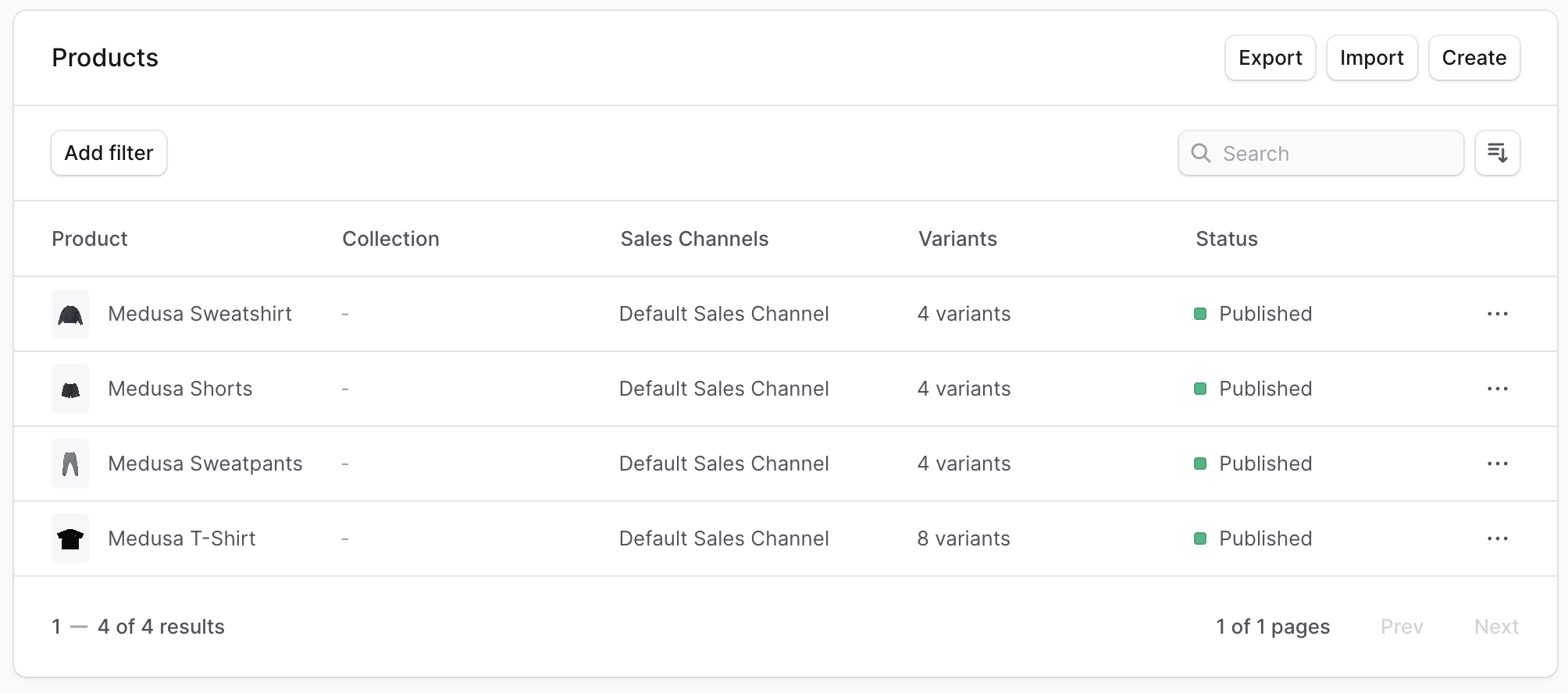
If you start your Medusa application and go to `localhost:9000/app/custom`, you'll see the data table showing the list of products with pagination, filtering, searching, and sorting functionalities.
|
|
|
|
### Full Example Code
|
|
|
|
```tsx title="src/admin/routes/custom/page.tsx"
|
|
import { defineRouteConfig } from "@medusajs/admin-sdk"
|
|
import { ChatBubbleLeftRight } from "@medusajs/icons"
|
|
import {
|
|
Badge,
|
|
createDataTableColumnHelper,
|
|
createDataTableFilterHelper,
|
|
DataTable,
|
|
DataTableFilteringState,
|
|
DataTablePaginationState,
|
|
DataTableSortingState,
|
|
Heading,
|
|
useDataTable,
|
|
} from "@medusajs/ui"
|
|
import { useQuery } from "@tanstack/react-query"
|
|
import { SingleColumnLayout } from "../../layouts/single-column"
|
|
import { sdk } from "../../lib/config"
|
|
import { useMemo, useState } from "react"
|
|
import { Container } from "../../components/container"
|
|
import { HttpTypes, ProductStatus } from "@medusajs/framework/types"
|
|
|
|
const columnHelper = createDataTableColumnHelper<HttpTypes.AdminProduct>()
|
|
|
|
const columns = [
|
|
columnHelper.accessor("title", {
|
|
header: "Title",
|
|
// Enables sorting for the column.
|
|
enableSorting: true,
|
|
// If omitted, the header will be used instead if it's a string,
|
|
// otherwise the accessor key (id) will be used.
|
|
sortLabel: "Title",
|
|
// If omitted the default value will be "A-Z"
|
|
sortAscLabel: "A-Z",
|
|
// If omitted the default value will be "Z-A"
|
|
sortDescLabel: "Z-A",
|
|
}),
|
|
columnHelper.accessor("status", {
|
|
header: "Status",
|
|
cell: ({ getValue }) => {
|
|
const status = getValue()
|
|
return (
|
|
<Badge color={status === "published" ? "green" : "grey"} size="xsmall">
|
|
{status === "published" ? "Published" : "Draft"}
|
|
</Badge>
|
|
)
|
|
},
|
|
}),
|
|
]
|
|
|
|
const filterHelper = createDataTableFilterHelper<HttpTypes.AdminProduct>()
|
|
|
|
const filters = [
|
|
filterHelper.accessor("status", {
|
|
type: "select",
|
|
label: "Status",
|
|
options: [
|
|
{
|
|
label: "Published",
|
|
value: "published",
|
|
},
|
|
{
|
|
label: "Draft",
|
|
value: "draft",
|
|
},
|
|
],
|
|
}),
|
|
]
|
|
|
|
const limit = 15
|
|
|
|
const CustomPage = () => {
|
|
const [pagination, setPagination] = useState<DataTablePaginationState>({
|
|
pageSize: limit,
|
|
pageIndex: 0,
|
|
})
|
|
const [search, setSearch] = useState<string>("")
|
|
const [filtering, setFiltering] = useState<DataTableFilteringState>({})
|
|
const [sorting, setSorting] = useState<DataTableSortingState | null>(null)
|
|
|
|
const offset = useMemo(() => {
|
|
return pagination.pageIndex * limit
|
|
}, [pagination])
|
|
const statusFilters = useMemo(() => {
|
|
return (filtering.status || []) as ProductStatus
|
|
}, [filtering])
|
|
|
|
const { data, isLoading } = useQuery({
|
|
queryFn: () => sdk.admin.product.list({
|
|
limit,
|
|
offset,
|
|
q: search,
|
|
status: statusFilters,
|
|
order: sorting ? `${sorting.desc ? "-" : ""}${sorting.id}` : undefined,
|
|
}),
|
|
queryKey: [["products", limit, offset, search, statusFilters, sorting?.id, sorting?.desc]],
|
|
})
|
|
|
|
const table = useDataTable({
|
|
columns,
|
|
data: data?.products || [],
|
|
getRowId: (row) => row.id,
|
|
rowCount: data?.count || 0,
|
|
isLoading,
|
|
pagination: {
|
|
state: pagination,
|
|
onPaginationChange: setPagination,
|
|
},
|
|
search: {
|
|
state: search,
|
|
onSearchChange: setSearch,
|
|
},
|
|
filtering: {
|
|
state: filtering,
|
|
onFilteringChange: setFiltering,
|
|
},
|
|
filters,
|
|
sorting: {
|
|
// Pass the pagination state and updater to the table instance
|
|
state: sorting,
|
|
onSortingChange: setSorting,
|
|
},
|
|
})
|
|
|
|
return (
|
|
<SingleColumnLayout>
|
|
<Container>
|
|
<DataTable instance={table}>
|
|
<DataTable.Toolbar className="flex flex-col items-start justify-between gap-2 md:flex-row md:items-center">
|
|
<Heading>Products</Heading>
|
|
<div className="flex gap-2">
|
|
<DataTable.FilterMenu tooltip="Filter" />
|
|
<DataTable.SortingMenu tooltip="Sort" />
|
|
<DataTable.Search placeholder="Search..." />
|
|
</div>
|
|
</DataTable.Toolbar>
|
|
<DataTable.Table />
|
|
<DataTable.Pagination />
|
|
</DataTable>
|
|
</Container>
|
|
</SingleColumnLayout>
|
|
)
|
|
}
|
|
|
|
export const config = defineRouteConfig({
|
|
label: "Custom",
|
|
icon: ChatBubbleLeftRight,
|
|
})
|
|
|
|
export default CustomPage
|
|
```
|