 938f3bd934
* update next

* updated react

* update eslint

* finish updating eslint

* fix content lint errors

* fix docs test

* fix vale action

* fix installation errors
272 lines
7.3 KiB
Plaintext
272 lines
7.3 KiB
Plaintext
---
|
|
sidebar_label: "Action Menu"
|
|
---
|
|
|
|
import { TypeList } from "docs-ui"
|
|
|
|
export const metadata = {
|
|
title: `Action Menu - Admin Components`,
|
|
}
|
|
|
|
# {metadata.title}
|
|
|
|
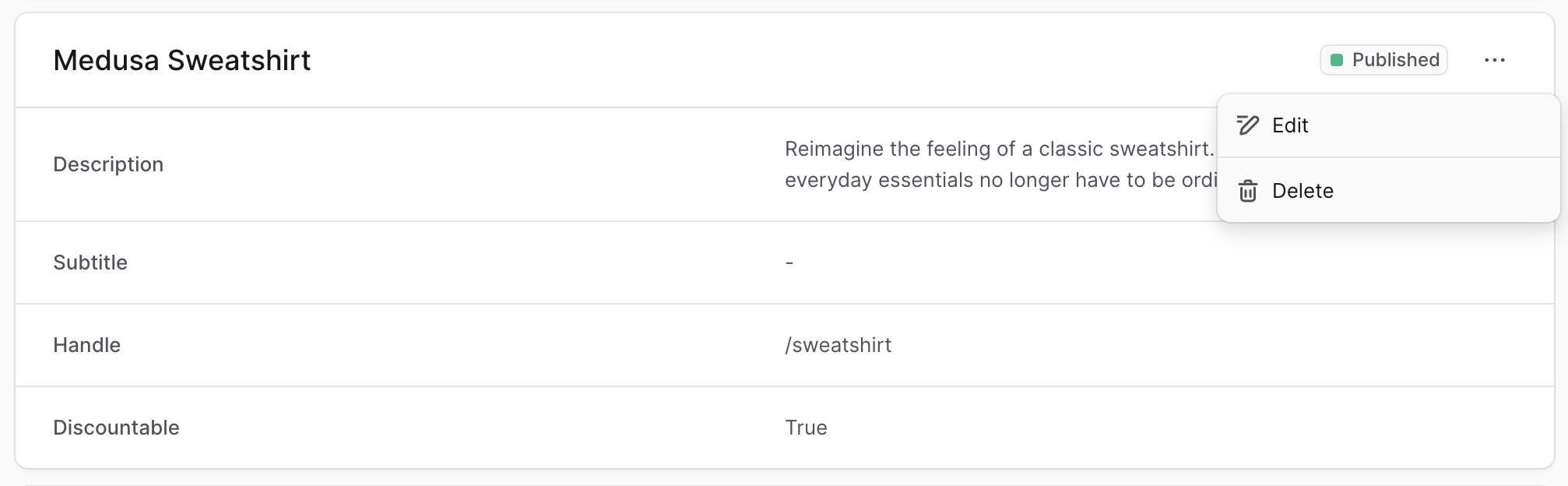
The Medusa Admin often provides additional actions in a dropdown shown when users click a three-dot icon.
|
|
|
|
|
|
|
|
To create a component that shows this menu in your customizations, create the file `src/admin/components/action-menu.tsx` with the following content:
|
|
|
|
```tsx title="src/admin/components/action-menu.tsx"
|
|
import {
|
|
DropdownMenu,
|
|
IconButton,
|
|
clx,
|
|
} from "@medusajs/ui"
|
|
import { EllipsisHorizontal } from "@medusajs/icons"
|
|
import { Link } from "react-router-dom"
|
|
|
|
export type Action = {
|
|
icon: React.ReactNode
|
|
label: string
|
|
disabled?: boolean
|
|
} & (
|
|
| {
|
|
to: string
|
|
onClick?: never
|
|
}
|
|
| {
|
|
onClick: () => void
|
|
to?: never
|
|
}
|
|
)
|
|
|
|
export type ActionGroup = {
|
|
actions: Action[]
|
|
}
|
|
|
|
export type ActionMenuProps = {
|
|
groups: ActionGroup[]
|
|
}
|
|
|
|
export const ActionMenu = ({ groups }: ActionMenuProps) => {
|
|
return (
|
|
<DropdownMenu>
|
|
<DropdownMenu.Trigger asChild>
|
|
<IconButton size="small" variant="transparent">
|
|
<EllipsisHorizontal />
|
|
</IconButton>
|
|
</DropdownMenu.Trigger>
|
|
<DropdownMenu.Content>
|
|
{groups.map((group, index) => {
|
|
if (!group.actions.length) {
|
|
return null
|
|
}
|
|
|
|
const isLast = index === groups.length - 1
|
|
|
|
return (
|
|
<DropdownMenu.Group key={index}>
|
|
{group.actions.map((action, index) => {
|
|
if (action.onClick) {
|
|
return (
|
|
<DropdownMenu.Item
|
|
disabled={action.disabled}
|
|
key={index}
|
|
onClick={(e) => {
|
|
e.stopPropagation()
|
|
action.onClick()
|
|
}}
|
|
className={clx(
|
|
"[&_svg]:text-ui-fg-subtle flex items-center gap-x-2",
|
|
{
|
|
"[&_svg]:text-ui-fg-disabled": action.disabled,
|
|
}
|
|
)}
|
|
>
|
|
{action.icon}
|
|
<span>{action.label}</span>
|
|
</DropdownMenu.Item>
|
|
)
|
|
}
|
|
|
|
return (
|
|
<div key={index}>
|
|
<DropdownMenu.Item
|
|
className={clx(
|
|
"[&_svg]:text-ui-fg-subtle flex items-center gap-x-2",
|
|
{
|
|
"[&_svg]:text-ui-fg-disabled": action.disabled,
|
|
}
|
|
)}
|
|
asChild
|
|
disabled={action.disabled}
|
|
>
|
|
<Link to={action.to} onClick={(e) => e.stopPropagation()}>
|
|
{action.icon}
|
|
<span>{action.label}</span>
|
|
</Link>
|
|
</DropdownMenu.Item>
|
|
</div>
|
|
)
|
|
})}
|
|
{!isLast && <DropdownMenu.Separator />}
|
|
</DropdownMenu.Group>
|
|
)
|
|
})}
|
|
</DropdownMenu.Content>
|
|
</DropdownMenu>
|
|
)
|
|
}
|
|
```
|
|
|
|
The `ActionMenu` component shows a three-dots icon (or `EllipsisHorizontal`) from the [Medusa Icons package](!ui!/icons/overview) in a button.
|
|
|
|
When the button is clicked, a dropdown menu is shown with the actions passed in the props.
|
|
|
|
The component accepts the following props:
|
|
|
|
<TypeList
|
|
types={[
|
|
{
|
|
name: "groups",
|
|
type: "`object[]`",
|
|
optional: false,
|
|
description: "Groups of actions to be shown in the dropdown. Each group is separated by a divider.",
|
|
children: [
|
|
{
|
|
name: "actions",
|
|
type: "`object[]`",
|
|
optional: false,
|
|
description: "Actions in the group.",
|
|
children: [
|
|
{
|
|
name: "icon",
|
|
type: "`React.ReactNode`",
|
|
optional: false,
|
|
description: `The icon of the action. You can use icons from the [Medusa Icons package](https://docs.medusajs.com/ui/icons/overview).`
|
|
},
|
|
{
|
|
name: "label",
|
|
type: "`string`",
|
|
optional: false,
|
|
description: "The action's text."
|
|
},
|
|
{
|
|
name: "disabled",
|
|
type: "`boolean`",
|
|
optional: true,
|
|
defaultValue: false,
|
|
description: "Whether the action is shown as disabled."
|
|
},
|
|
{
|
|
name: "`to`",
|
|
type: "`string`",
|
|
optional: true,
|
|
description: "The link to take the user to when they click the action. This is required if `onClick` isn't provided."
|
|
},
|
|
{
|
|
name: "`onClick`",
|
|
type: "`() => void`",
|
|
optional: true,
|
|
description: "The function to execute when the action is clicked. This is required if `to` isn't provided."
|
|
}
|
|
]
|
|
}
|
|
]
|
|
}
|
|
]}
|
|
/>
|
|
|
|
---
|
|
|
|
## Example
|
|
|
|
Use the `ActionMenu` component in any widget or UI route.
|
|
|
|
For example, create the widget `src/admin/widgets/product-widget.tsx` with the following content:
|
|
|
|
```tsx title="src/admin/widgets/product-widget.tsx"
|
|
import { defineWidgetConfig } from "@medusajs/admin-sdk"
|
|
import { Pencil } from "@medusajs/icons"
|
|
import { Container } from "../components/container"
|
|
import { ActionMenu } from "../components/action-menu"
|
|
|
|
const ProductWidget = () => {
|
|
return (
|
|
<Container>
|
|
<ActionMenu groups={[
|
|
{
|
|
actions: [
|
|
{
|
|
icon: <Pencil />,
|
|
label: "Edit",
|
|
onClick: () => {
|
|
alert("You clicked the edit action!")
|
|
},
|
|
},
|
|
],
|
|
},
|
|
]} />
|
|
</Container>
|
|
)
|
|
}
|
|
|
|
export const config = defineWidgetConfig({
|
|
zone: "product.details.before",
|
|
})
|
|
|
|
export default ProductWidget
|
|
```
|
|
|
|
This widget also uses a [Container](../container/page.mdx) custom component.
|
|
|
|
### Use in Header
|
|
|
|
You can also use the action menu in the [Header](../header/page.mdx) component as part of its actions.
|
|
|
|
For example:
|
|
|
|
```tsx title="src/admin/widgets/product-widget.tsx"
|
|
import { defineWidgetConfig } from "@medusajs/admin-sdk"
|
|
import { Pencil } from "@medusajs/icons"
|
|
import { Container } from "../components/container"
|
|
import { Header } from "../components/header"
|
|
|
|
const ProductWidget = () => {
|
|
return (
|
|
<Container>
|
|
<Header
|
|
title="Product Widget"
|
|
subtitle="This is my custom product widget"
|
|
actions={[
|
|
{
|
|
type: "action-menu",
|
|
props: {
|
|
groups: [
|
|
{
|
|
actions: [
|
|
{
|
|
icon: <Pencil />,
|
|
label: "Edit",
|
|
onClick: () => {
|
|
alert("You clicked the edit action!")
|
|
},
|
|
},
|
|
],
|
|
},
|
|
],
|
|
},
|
|
},
|
|
]}
|
|
/>
|
|
</Container>
|
|
)
|
|
}
|
|
|
|
export const config = defineWidgetConfig({
|
|
zone: "product.details.before",
|
|
})
|
|
|
|
export default ProductWidget
|
|
```
|