* update next

* updated react

* update eslint

* finish updating eslint

* fix content lint errors

* fix docs test

* fix vale action

* fix installation errors
89 lines
2.2 KiB
Plaintext
89 lines
2.2 KiB
Plaintext
---
|
|
sidebar_label: "Two Column"
|
|
---
|
|
|
|
export const metadata = {
|
|
title: `Two Column Layout - Admin Components`,
|
|
}
|
|
|
|
# {metadata.title}
|
|
|
|
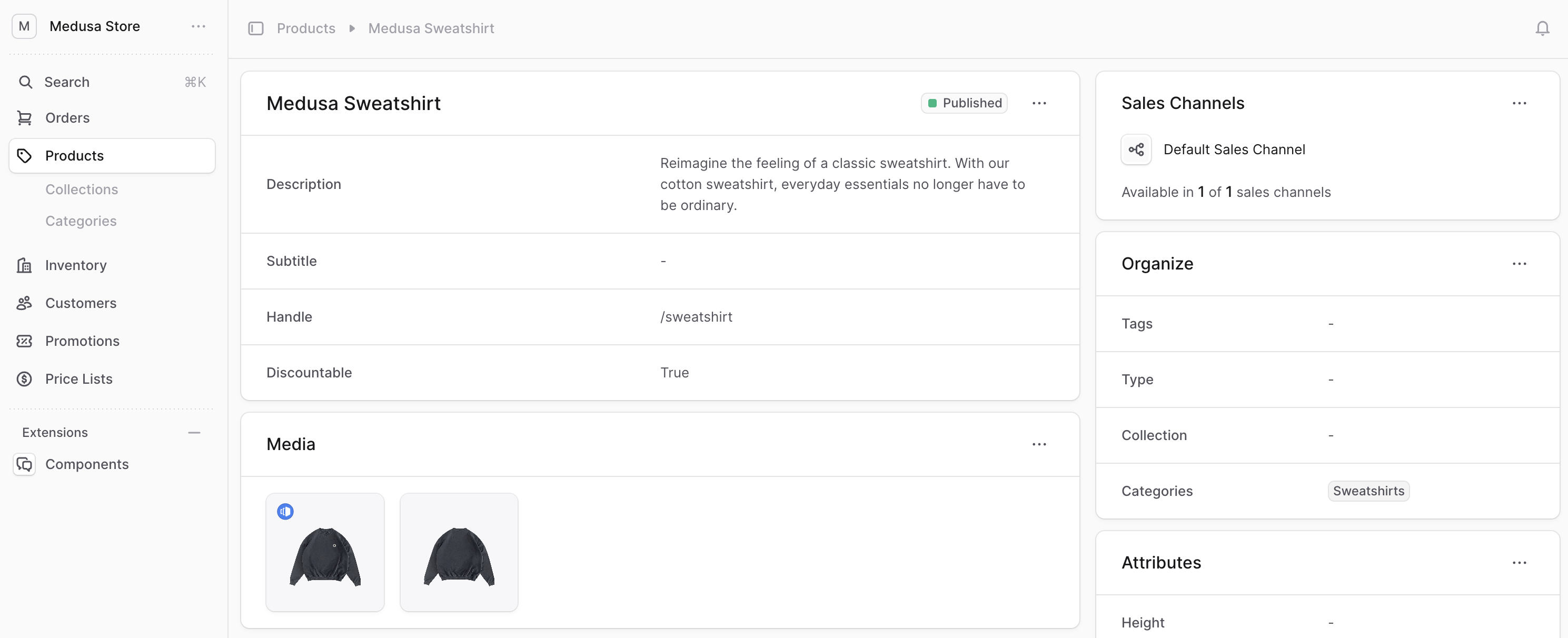
The Medusa Admin has pages with two columns of content.
|
|
|
|
<Note>
|
|
|
|
This doesn't include the sidebar, only the main content.
|
|
|
|
</Note>
|
|
|
|

|
|
|
|
To create a layout that you can use in UI routes to support two columns of content, create the component `src/admin/layouts/two-column.tsx` with the following content:
|
|
|
|
```tsx title="src/admin/layouts/two-column.tsx"
|
|
export type TwoColumnLayoutProps = {
|
|
firstCol: React.ReactNode
|
|
secondCol: React.ReactNode
|
|
}
|
|
|
|
export const TwoColumnLayout = ({
|
|
firstCol,
|
|
secondCol,
|
|
}: TwoColumnLayoutProps) => {
|
|
return (
|
|
<div className="flex flex-col gap-x-4 gap-y-3 xl:flex-row xl:items-start">
|
|
<div className="flex w-full flex-col gap-y-3">
|
|
{firstCol}
|
|
</div>
|
|
<div className="flex w-full max-w-[100%] flex-col gap-y-3 xl:mt-0 xl:max-w-[440px]">
|
|
{secondCol}
|
|
</div>
|
|
</div>
|
|
)
|
|
}
|
|
```
|
|
|
|
The `TwoColumnLayout` accepts two props:
|
|
|
|
- `firstCol` indicating the content of the first column.
|
|
- `secondCol` indicating the content of the second column.
|
|
|
|
---
|
|
|
|
## Example
|
|
|
|
Use the `TwoColumnLayout` component in your UI routes that have a single column. For example:
|
|
|
|
```tsx title="src/admin/routes/custom/page.tsx" highlights={[["9"]]}
|
|
import { defineRouteConfig } from "@medusajs/admin-sdk"
|
|
import { ChatBubbleLeftRight } from "@medusajs/icons"
|
|
import { Container } from "../../components/container"
|
|
import { Header } from "../../components/header"
|
|
import { TwoColumnLayout } from "../../layouts/two-column"
|
|
|
|
const CustomPage = () => {
|
|
return (
|
|
<TwoColumnLayout
|
|
firstCol={
|
|
<Container>
|
|
<Header title="First Column" />
|
|
</Container>
|
|
}
|
|
secondCol={
|
|
<Container>
|
|
<Header title="Second Column" />
|
|
</Container>
|
|
}
|
|
/>
|
|
)
|
|
}
|
|
|
|
export const config = defineRouteConfig({
|
|
label: "Custom",
|
|
icon: ChatBubbleLeftRight,
|
|
})
|
|
|
|
export default CustomPage
|
|
```
|
|
|
|
This UI route also uses [Container](../../components/container/page.mdx) and [Header]() custom components. |