357 lines
10 KiB
Plaintext
357 lines
10 KiB
Plaintext
---
|
|
sidebar_label: "Table"
|
|
---
|
|
|
|
import { TypeList } from "docs-ui"
|
|
|
|
export const metadata = {
|
|
title: `Table - Admin Components`,
|
|
}
|
|
|
|
# {metadata.title}
|
|
|
|
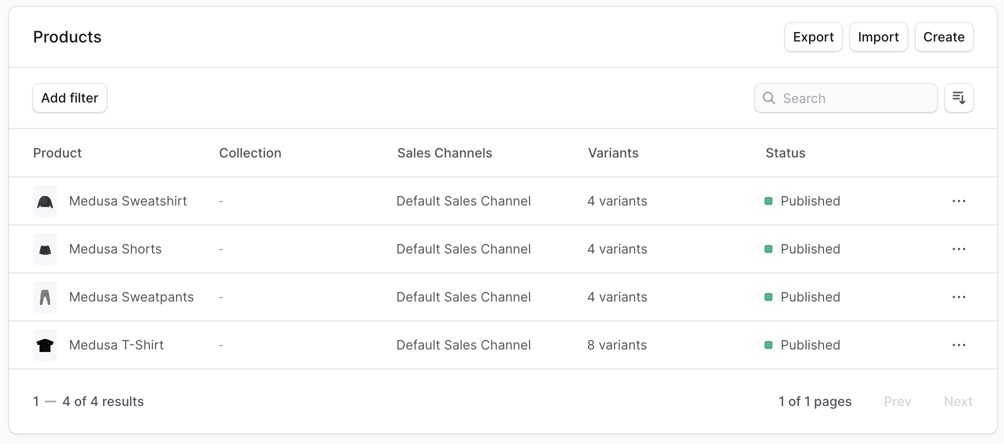
The listing pages in the Admin show a table with pagination.
|
|
|
|
|
|
|
|
To create a component that shows a table with pagination, create the file `src/admin/components/table.tsx` with the following content:
|
|
|
|
```tsx title="src/admin/components/table.tsx"
|
|
import { useMemo } from "react"
|
|
import { Table as UiTable } from "@medusajs/ui"
|
|
|
|
export type TableProps = {
|
|
columns: {
|
|
key: string
|
|
label?: string
|
|
render?: (value: unknown) => React.ReactNode
|
|
}[]
|
|
data: Record<string, unknown>[]
|
|
pageSize: number
|
|
count: number
|
|
currentPage: number
|
|
setCurrentPage: (value: number) => void
|
|
}
|
|
|
|
export const Table = ({
|
|
columns,
|
|
data,
|
|
pageSize,
|
|
count,
|
|
currentPage,
|
|
setCurrentPage,
|
|
}: TableProps) => {
|
|
const pageCount = useMemo(() => {
|
|
return Math.ceil(count / pageSize)
|
|
}, [data, pageSize])
|
|
|
|
const canNextPage = useMemo(() => {
|
|
return currentPage < pageCount - 1
|
|
}, [currentPage, pageCount])
|
|
const canPreviousPage = useMemo(() => {
|
|
return currentPage - 1 >= 0
|
|
}, [currentPage])
|
|
|
|
const nextPage = () => {
|
|
if (canNextPage) {
|
|
setCurrentPage(currentPage + 1)
|
|
}
|
|
}
|
|
|
|
const previousPage = () => {
|
|
if (canPreviousPage) {
|
|
setCurrentPage(currentPage - 1)
|
|
}
|
|
}
|
|
|
|
return (
|
|
<div className="flex h-full flex-col overflow-hidden !border-t-0">
|
|
<UiTable>
|
|
<UiTable.Header>
|
|
<UiTable.Row>
|
|
{columns.map((column, index) => (
|
|
<UiTable.HeaderCell key={index}>
|
|
{column.label || column.key}
|
|
</UiTable.HeaderCell>
|
|
))}
|
|
</UiTable.Row>
|
|
</UiTable.Header>
|
|
<UiTable.Body>
|
|
{data.map((item, index) => {
|
|
const rowIndex = "id" in item ? item.id as string : index
|
|
return (
|
|
<UiTable.Row key={rowIndex}>
|
|
{columns.map((column, index) => (
|
|
<UiTable.Cell key={`${rowIndex}-${index}`}>
|
|
<>
|
|
{column.render && column.render(item[column.key])}
|
|
{!column.render && (
|
|
<>{item[column.key] as string}</>
|
|
)}
|
|
</>
|
|
</UiTable.Cell>
|
|
))}
|
|
</UiTable.Row>
|
|
)
|
|
})}
|
|
</UiTable.Body>
|
|
</UiTable>
|
|
<UiTable.Pagination
|
|
count={count}
|
|
pageSize={pageSize}
|
|
pageIndex={currentPage}
|
|
pageCount={pageCount}
|
|
canPreviousPage={canPreviousPage}
|
|
canNextPage={canNextPage}
|
|
previousPage={previousPage}
|
|
nextPage={nextPage}
|
|
/>
|
|
</div>
|
|
)
|
|
}
|
|
```
|
|
|
|
The `Table` component uses the component from the [UI package](!ui!/components/table), with additional styling and rendering of data.
|
|
|
|
It accepts the following props:
|
|
|
|
<TypeList
|
|
types={[
|
|
{
|
|
name: "columns",
|
|
type: "`object[]`",
|
|
optional: false,
|
|
description: "The table's columns.",
|
|
children: [
|
|
{
|
|
name: "key",
|
|
type: "`string`",
|
|
optional: false,
|
|
description: "The column's key in the passed `data`"
|
|
},
|
|
{
|
|
name: "label",
|
|
type: "`string`",
|
|
optional: true,
|
|
description: "The column's label shown in the table. If not provided, the `key` is used."
|
|
},
|
|
{
|
|
name: "render",
|
|
type: "`(value: unknown) => React.ReactNode`",
|
|
optional: true,
|
|
description: "By default, the data is shown as-is in the table. You can use this function to change how the value is rendered. The function receives the value is a parameter and returns a React node."
|
|
}
|
|
]
|
|
},
|
|
{
|
|
name: "data",
|
|
type: "`Record<string, unknown>[]`",
|
|
optional: false,
|
|
description: "The data to show in the table for the current page. The keys of each object should be in the `columns` array."
|
|
},
|
|
{
|
|
name: "pageSize",
|
|
type: "`number`",
|
|
optional: false,
|
|
description: "The number of items to show per page."
|
|
},
|
|
{
|
|
name: "count",
|
|
type: "`number`",
|
|
optional: false,
|
|
description: "The total number of items."
|
|
},
|
|
{
|
|
name: "currentPage",
|
|
type: "`number`",
|
|
optional: false,
|
|
description: "A zero-based index indicating the current page's number."
|
|
},
|
|
{
|
|
name: "setCurrentPage",
|
|
type: "`(value: number) => void`",
|
|
optional: false,
|
|
description: "A function used to change the current page."
|
|
}
|
|
]}
|
|
/>
|
|
|
|
---
|
|
|
|
## Example
|
|
|
|
Use the `Table` component in any widget or UI route.
|
|
|
|
For example, create the widget `src/admin/widgets/product-widget.tsx` with the following content:
|
|
|
|
```tsx title="src/admin/widgets/product-widget.tsx"
|
|
import { defineWidgetConfig } from "@medusajs/admin-sdk"
|
|
import { StatusBadge } from "@medusajs/ui"
|
|
import { Table } from "../components/table"
|
|
import { useState } from "react"
|
|
import { Container } from "../components/container"
|
|
|
|
const ProductWidget = () => {
|
|
const [currentPage, setCurrentPage] = useState(0)
|
|
|
|
return (
|
|
<Container>
|
|
<Table
|
|
columns={[
|
|
{
|
|
key: "name",
|
|
label: "Name",
|
|
},
|
|
{
|
|
key: "is_enabled",
|
|
label: "Status",
|
|
render: (value: unknown) => {
|
|
const isEnabled = value as boolean
|
|
|
|
return (
|
|
<StatusBadge color={isEnabled ? "green" : "grey"}>
|
|
{isEnabled ? "Enabled" : "Disabled"}
|
|
</StatusBadge>
|
|
)
|
|
},
|
|
},
|
|
]}
|
|
data={[
|
|
{
|
|
name: "John",
|
|
is_enabled: true,
|
|
},
|
|
{
|
|
name: "Jane",
|
|
is_enabled: false,
|
|
},
|
|
]}
|
|
pageSize={2}
|
|
count={2}
|
|
currentPage={currentPage}
|
|
setCurrentPage={setCurrentPage}
|
|
/>
|
|
</Container>
|
|
)
|
|
}
|
|
|
|
export const config = defineWidgetConfig({
|
|
zone: "product.details.before",
|
|
})
|
|
|
|
export default ProductWidget
|
|
```
|
|
|
|
This widget also uses the [Container](../container.mdx) custom component.
|
|
|
|
---
|
|
|
|
## Example With Data Fetching
|
|
|
|
This section shows you how to use the `Table` component when fetching data from the Medusa application's API routes.
|
|
|
|
Assuming you've set up the JS SDK as explained in [this guide](../../../js-sdk/page.mdx), create the UI route `src/admin/routes/custom/page.tsx` with the following content:
|
|
|
|
export const tableExampleHighlights = [
|
|
["12", "currentPage", "The table's current page."],
|
|
["13", "limit", "The maximum number of items per page."],
|
|
["14", "offset", "The number of items to skip before retrieving the current page's items."],
|
|
["18", "data", "The response fields."],
|
|
["18", "useQuery", "Fetch products from the Medusa application."]
|
|
]
|
|
|
|
```tsx title="src/admin/routes/custom/page.tsx" collapsibleLines="1-10" expandButtonLabel="Show Imports" highlights={tableExampleHighlights}
|
|
import { defineRouteConfig } from "@medusajs/admin-sdk"
|
|
import { ChatBubbleLeftRight } from "@medusajs/icons"
|
|
import { useQuery } from "@tanstack/react-query"
|
|
import { SingleColumnLayout } from "../../layouts/single-column"
|
|
import { Table } from "../../components/table"
|
|
import { sdk } from "../../lib/config"
|
|
import { useMemo, useState } from "react"
|
|
import { Container } from "../../components/container"
|
|
import { Header } from "../../components/header"
|
|
|
|
const CustomPage = () => {
|
|
const [currentPage, setCurrentPage] = useState(0)
|
|
const limit = 15
|
|
const offset = useMemo(() => {
|
|
return currentPage * limit
|
|
}, [currentPage])
|
|
|
|
const { data } = useQuery({
|
|
queryFn: () => sdk.admin.product.list({
|
|
limit,
|
|
offset,
|
|
}),
|
|
queryKey: [["products", limit, offset]],
|
|
})
|
|
|
|
// TODO display table
|
|
}
|
|
|
|
export const config = defineRouteConfig({
|
|
label: "Custom",
|
|
icon: ChatBubbleLeftRight,
|
|
})
|
|
|
|
export default CustomPage
|
|
```
|
|
|
|
In the `CustomPage` component, you define:
|
|
|
|
- A state variable `currentPage` that stores the current page of the table.
|
|
- A `limit` variable, indicating how many items to retrieve per page
|
|
- An `offset` memoized variable indicating how many items to skip before the retrieved items. It's calculated as a multiplication of `currentPage` and `limit`.
|
|
|
|
Then, you use `useQuery` from [Tanstack Query](https://tanstack.com/query/latest) to retrieve products using the JS SDK. You pass `limit` and `offset` as query parameters, and you set the `queryKey`, which is used for caching and revalidation, to be based on the key `products`, along with the current limit and offset. So, whenever the `offset` variable changes, the request is sent again to retrieve the products of the current page.
|
|
|
|
<Note title="Tip">
|
|
|
|
You can change the query to send a request to a custom API route as explained in [this guide](../../../js-sdk/page.mdx#send-requests-to-custom-routes).
|
|
|
|
</Note>
|
|
|
|
`useQuery` returns an object containing `data`, which holds the response fields including the products and pagination fields.
|
|
|
|
Then, to display the table, replace the `TODO` with the following:
|
|
|
|
```tsx
|
|
return (
|
|
<SingleColumnLayout>
|
|
<Container>
|
|
<Header title="Products" />
|
|
{data && (
|
|
<Table
|
|
columns={[
|
|
{
|
|
key: "id",
|
|
label: "ID",
|
|
},
|
|
{
|
|
key: "title",
|
|
label: "Title",
|
|
},
|
|
]}
|
|
data={data.products as any}
|
|
pageSize={data.limit}
|
|
count={data.count}
|
|
currentPage={currentPage}
|
|
setCurrentPage={setCurrentPage}
|
|
/>
|
|
)}
|
|
</Container>
|
|
</SingleColumnLayout>
|
|
)
|
|
```
|
|
|
|
Aside from the `Table` component, this UI route also uses the [SingleColumnLayout](../../layouts/single-column/page.mdx), [Container](../container/page.mdx), and [Header](../header/page.mdx) custom component.
|
|
|
|
If `data` isn't `undefined`, you display the `Table` component passing it the following props:
|
|
|
|
- `columns`: The columns to show. You only show the product's ID and title.
|
|
- `data`: The rows of the table. You pass it the `products` property of `data`.
|
|
- `pageSize`: The maximum number of items per page. You pass it the `count` property of `data`.
|
|
- `currentPage` and `setCurrentPage`: The current page and the function to change it.
|
|
|
|
To test it out, log into the Medusa Admin and open `http://localhost:9000/app/custom`. You'll find a table of products with pagination.
|