 74b286b701
- Documented common admin components with design that matches the admin.
- Updated existing admin customization snippets to match the admin's design.

Closes DOCS-964
120 lines
2.9 KiB
Plaintext
120 lines
2.9 KiB
Plaintext
---
|
|
sidebar_label: "Section Row"
|
|
---
|
|
|
|
import { TypeList } from "docs-ui"
|
|
|
|
export const metadata = {
|
|
title: `Section Row - Admin Components`,
|
|
}
|
|
|
|
# {metadata.title}
|
|
|
|
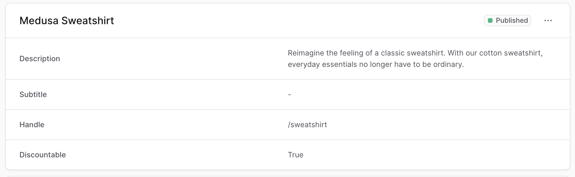
The Medusa Admin often shows information in rows of label-values, such as when showing a product's details.
|
|
|
|
|
|
|
|
To create a component that shows information in the same structure, create the file `src/admin/components/section-row.tsx` with the following content:
|
|
|
|
```tsx title="src/admin/components/section-row.tsx"
|
|
import { Text, clx } from "@medusajs/ui"
|
|
|
|
export type SectionRowProps = {
|
|
title: string
|
|
value?: React.ReactNode | string | null
|
|
actions?: React.ReactNode
|
|
}
|
|
|
|
export const SectionRow = ({ title, value, actions }: SectionRowProps) => {
|
|
const isValueString = typeof value === "string" || !value
|
|
|
|
return (
|
|
<div
|
|
className={clx(
|
|
`text-ui-fg-subtle grid grid-cols-2 items-center px-6 py-4`,
|
|
{
|
|
"grid-cols-[1fr_1fr_28px]": !!actions,
|
|
}
|
|
)}
|
|
>
|
|
<Text size="small" weight="plus" leading="compact">
|
|
{title}
|
|
</Text>
|
|
|
|
{isValueString ? (
|
|
<Text
|
|
size="small"
|
|
leading="compact"
|
|
className="whitespace-pre-line text-pretty"
|
|
>
|
|
{value ?? "-"}
|
|
</Text>
|
|
) : (
|
|
<div className="flex flex-wrap gap-1">{value}</div>
|
|
)}
|
|
|
|
{actions && <div>{actions}</div>}
|
|
</div>
|
|
)
|
|
}
|
|
```
|
|
|
|
The `SectionRow` component shows a title and a value in the same row.
|
|
|
|
It accepts the following props:
|
|
|
|
<TypeList
|
|
types={[
|
|
{
|
|
name: "title",
|
|
type: "`string`",
|
|
optional: false,
|
|
description: "The title to show on the left side."
|
|
},
|
|
{
|
|
name: "value",
|
|
type: "`React.ReactNode` \\| `string` \\| `null`",
|
|
optional: true,
|
|
description: "The value to show on the right side."
|
|
},
|
|
{
|
|
name: "actions",
|
|
type: "`React.ReactNode`",
|
|
optional: true,
|
|
description: "The actions to show at the end of the row."
|
|
}
|
|
]}
|
|
/>
|
|
|
|
---
|
|
|
|
## Example
|
|
|
|
Use the `SectionRow` component in any widget or UI route.
|
|
|
|
For example, create the widget `src/admin/widgets/product-widget.tsx` with the following content:
|
|
|
|
```tsx title="src/admin/widgets/product-widget.tsx"
|
|
import { defineWidgetConfig } from "@medusajs/admin-sdk"
|
|
import { Container } from "../components/container"
|
|
import { Header } from "../components/header"
|
|
import { SectionRow } from "../components/section-row"
|
|
|
|
const ProductWidget = () => {
|
|
return (
|
|
<Container>
|
|
<Header title="Product Widget" />
|
|
<SectionRow title="Name" value="John" />
|
|
</Container>
|
|
)
|
|
}
|
|
|
|
export const config = defineWidgetConfig({
|
|
zone: "product.details.before",
|
|
})
|
|
|
|
export default ProductWidget
|
|
```
|
|
|
|
This widget also uses the [Container](../container/page.mdx) and [Header](../header/page.mdx) custom component.
|